What is meta-analysis?
Meta-analysis is the combined analysis of multiple existing data sets to arrive at a single conclusion. Our data represent meta-analysis of gene expression microarrays across diseases to identify consistent gene expression signatures in a specific disease state.
Why meta-analysis?
The best researchers in the world studying almost every disease have deposited data from millions of microarrays into public databases. Through meta-analysis, we are able to combine all these studies to gain novel insights into the factors driving disease. When examined in the context of a single study, research may have been limited by a number of factors, including: sample size, cohort population bias, tissue bias, microarray platform choice. Meta-analysis leverages the diversity of all these factors to identify the signal which persists despite all the noise. In disease-specific settings, our meta-analyses have led to the identification of biomarkers, drug targets, and drug repurposing candidates in Ras-driven cancer , organ transplanation , lung cancer , neurodegenerative diseases , and sepsis .
How much data has been analyzed?
Who performed the meta-analysis?
All meta-analyses were performed by the Khatri Lab at Stanford University.
Where is the data from?
A vast majority of the underlying microarray data was downloaded from the NCBI GEO and ArrayExpress repositories.
What is a forest plot?

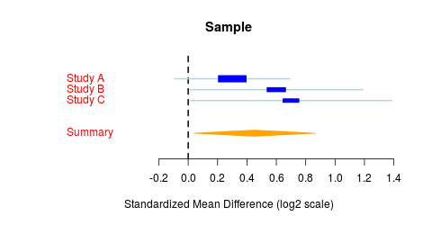
On the x-axis is the effect size, which is esentially the log-scaled fold change in disease relative to control. A positive effect size represents up-regulation in disease. Each row of the forest plot contains a box-and-whiskers plot, where the box is centered at the mean effect size for that row and the whiskers extend to the 95% confidence interval for that estimation. The box is also scaled to standard error, where a large box indicates low standard error and a high-confidence prediction. The bottom row of the forest plot contains a summary statistic illustrated as a rhombus, where the rhombus is centered at the mean effect size and the width is proportional to the standard error.
What is a correlation plot?
In a correlation plot, each cell coloring represents the correlation coefficient between the corresponding row and column. A high correlation means that two items are highly similar to each other. Highly correlated rows/columns are clustered.
Walkthrough examples
Interested in a Gene?
Consider we are a researcher who has developed an inhibitor of CXCL10. We may take the following steps:
1. Look at the disease where CXCL10 is most up-regulated by typing 'CXCL10' in the left toolbar and selecting the tabs 'a Gene' and 'Disease Effect Sizes'. ( here )
2. Having observed that CXCL10 is up-regulated in transplant rejection, look at the study level data by typing 'Transplant Rejection' in the sidebar and selecting the tabs 'a Gene' and 'Disease Drilldown'. ( here )
3. Identify the cell types in which CXCL10 is most up-regulated in by selecting the 'a Gene' and 'Cell Specific Expression' tabs. ( here )
4. Follow up by applying your drug to mouse models of transplant rejection.
Interested in a Disease?
Consider that we are a researcher who is interested in transplant rejection. We may take the following steps:
1. Observe what other diseases have a similar gene expression profile by typing 'Transplant Rejection' in the left toolbar and selecting the 'a Disease' and 'Correlation' tabs. ( here )
2. Identify the most differentially expressed genes in transplant rejection by selecting the 'Top genes for disease' tab. You will see ( here )
3. Having observed that CXCL10 is up-regulated in transplant rejection, look at the study level data by typing 'Transplant Rejection' in the sidebar and selecting the tabs 'a Gene' and 'Disease Drilldown'. ( here )
4. Follow up by identifying effective CXCL10 inhibitors and applying them to mouse models of transplant rejection.
Troubleshooting
Why are no plots being displayed?
Please be sure that you have selected gene name(s) and/or disease name(s) in the left sidebar, depending on the plot you are trying to display.
Other issues?
If you are having issues, particularly with the interactive components of this website, please download a modern web browser like Chrome or Firefox . If issues continue, please contact metasignature-developers@lists.stanford.edu
Effect size for all diseases for the first selected gene.
Effect sizes for the first selected gene and all selected diseases.
All diseases for the selected gene are displayed
Note: all p-values are unadjusted for multiple comparisons.
Correlation of genes is calculated based on the effect sizes for all diseases.
Correlation of each disease is calculated based on the effect sizes for the genes selected in the sidebar. Works best with 5 or more genes.
All diseases for the selected gene are displayed
Note: all p-values are unadjusted for multiple comparisons.
Correlation of each disease is calculated based on the p-values for pathway differential expression.
Values displayed are p-values from DEAP: Differential Expression Analysis for Pathways on the selected diseases.
Analysis powered by DEAP: Differential Expression Analysis for Pathways . Pathways from the PANTHER pathway database
Correlation of each disease is calculated based on the effect sizes for all genes which are identified at a false discovery rate less than 5% in either disease. Hover over cells for more details.
Effect sizes for the top genes for the first selected disease.
Effect sizes for the first selected disease and all selected genes.
Top genes for the selected diseases are displayed
Note: all p-values are unadjusted for multiple comparisons.
What is meta-analysis?
Meta-analysis is the combined analysis of multiple existing data sets to arrive at a single conclusion. Our data represent meta-analysis of gene expression microarrays across diseases to identify consistent gene expression signatures in a specific disease state.
Why meta-analysis?
The best researchers in the world studying almost every disease have deposited data from millions of microarrays into public databases. Through meta-analysis, we are able to combine all these studies to gain novel insights into the factors driving disease. When examined in the context of a single study, research may have been limited by a number of factors, including: sample size, cohort population bias, tissue bias, microarray platform choice. Meta-analysis leverages the diversity of all these factors to identify the signal which persists despite all the noise. In disease-specific settings, our meta-analyses have led to the identification of biomarkers, drug targets, and drug repurposing candidates in Ras-driven cancer , organ transplanation , lung cancer , neurodegenerative diseases , and sepsis .
How much data has been analyzed?
Who performed the meta-analysis?
All meta-analyses were performed by the Khatri Lab at Stanford University.
Where is the data from?
A vast majority of the underlying microarray data was downloaded from the NCBI GEO and ArrayExpress repositories.
What is a forest plot?

On the x-axis is the effect size, which is esentially the log-scaled fold change in disease relative to control. A positive effect size represents up-regulation in disease. Each row of the forest plot contains a box-and-whiskers plot, where the box is centered at the mean effect size for that row and the whiskers extend to the 95% confidence interval for that estimation. The box is also scaled to standard error, where a large box indicates low standard error and a high-confidence prediction. The bottom row of the forest plot contains a summary statistic illustrated as a rhombus, where the rhombus is centered at the mean effect size and the width is proportional to the standard error.
What is a correlation plot?
In a correlation plot, each cell coloring represents the correlation coefficient between the corresponding row and column. A high correlation means that two items are highly similar to each other. Highly correlated rows/columns are clustered.
Walkthrough examples
Interested in a Gene?
Consider we are a researcher who has developed an inhibitor of CXCL10. We may take the following steps:
1. Look at the disease where CXCL10 is most up-regulated by typing 'CXCL10' in the left toolbar and selecting the tabs 'a Gene' and 'Disease Effect Sizes'. ( here )
2. Having observed that CXCL10 is up-regulated in transplant rejection, look at the study level data by typing 'Transplant Rejection' in the sidebar and selecting the tabs 'a Gene' and 'Disease Drilldown'. ( here )
3. Identify the cell types in which CXCL10 is most up-regulated in by selecting the 'a Gene' and 'Cell Specific Expression' tabs. ( here )
4. Follow up by applying your drug to mouse models of transplant rejection.
Interested in a Disease?
Consider that we are a researcher who is interested in transplant rejection. We may take the following steps:
1. Observe what other diseases have a similar gene expression profile by typing 'Transplant Rejection' in the left toolbar and selecting the 'a Disease' and 'Correlation' tabs. ( here )
2. Identify the most differentially expressed genes in transplant rejection by selecting the 'Top genes for disease' tab. You will see ( here )
3. Having observed that CXCL10 is up-regulated in transplant rejection, look at the study level data by typing 'Transplant Rejection' in the sidebar and selecting the tabs 'a Gene' and 'Disease Drilldown'. ( here )
4. Follow up by identifying effective CXCL10 inhibitors and applying them to mouse models of transplant rejection.
Troubleshooting
Why are no plots being displayed?
Please be sure that you have selected gene name(s) and/or disease name(s) in the left sidebar, depending on the plot you are trying to display.
Other issues?
If you are having issues, particularly with the interactive components of this website, please download a modern web browser like Chrome or Firefox . If issues continue, please contact metasignature-developers@lists.stanford.edu